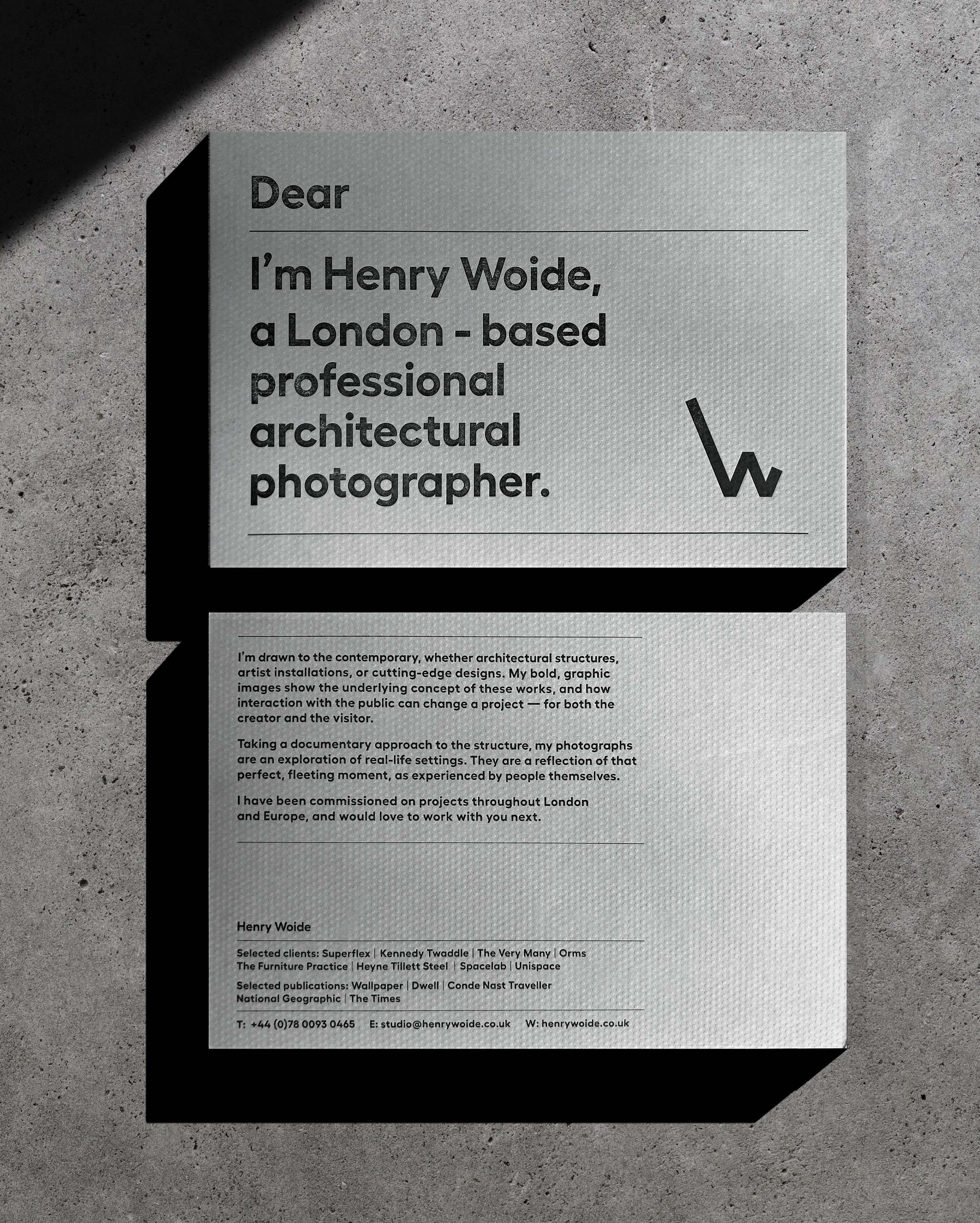
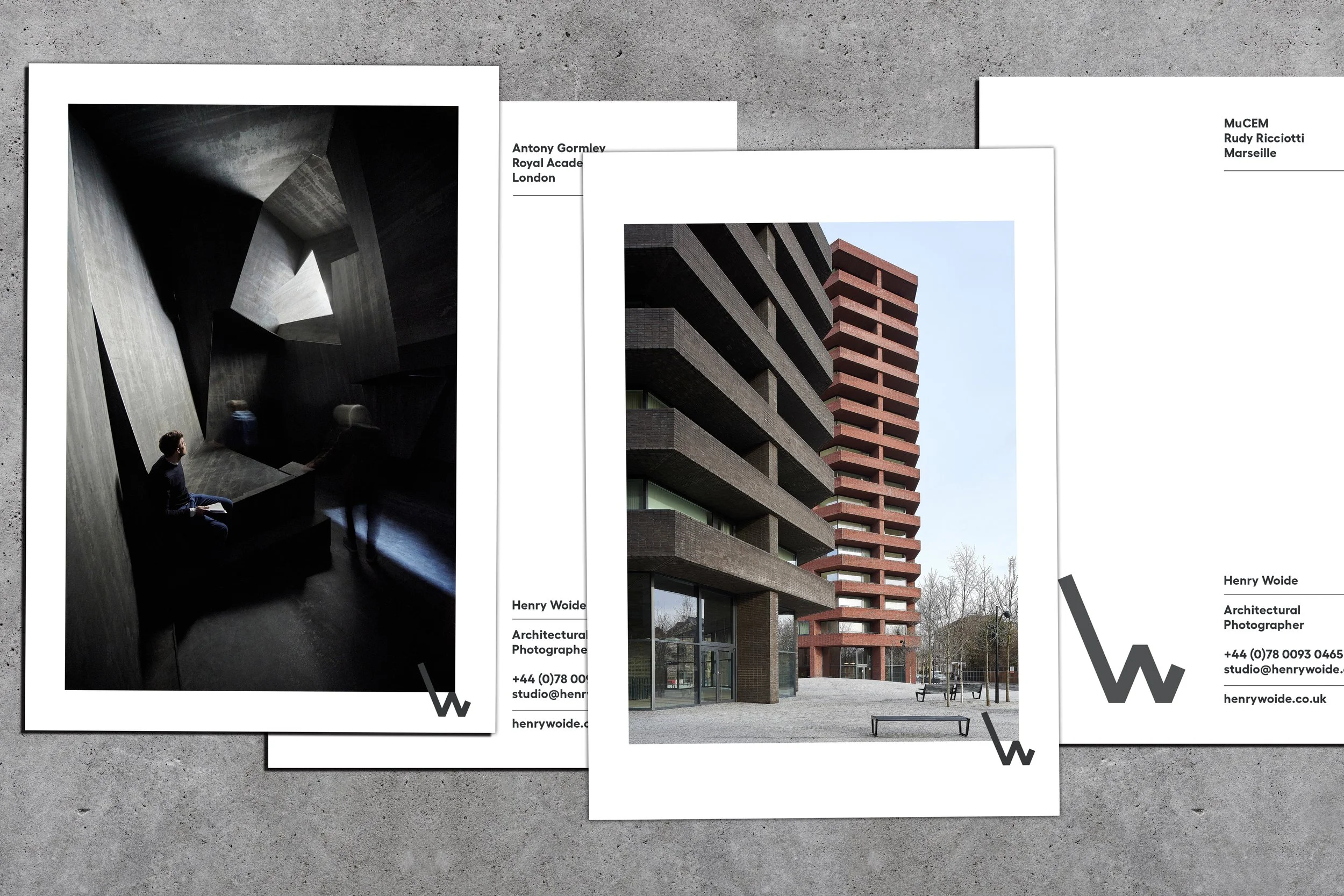
Brand identity for Henry Woide, a UK-based contemporary architectural photographer whose work is featured in Wallpaper, Dwell, Dezeen, and ArchDaily. The custom monogram merges a lowercase ‘h’ and uppercase ‘W’ of his initials into a single, unified mark. Drawing from a shared passion for brutalist architecture, the stationery utilises letterpress printing on premium paper stock with a custom-embossed finish to emulate the raw texture of concrete slabs.
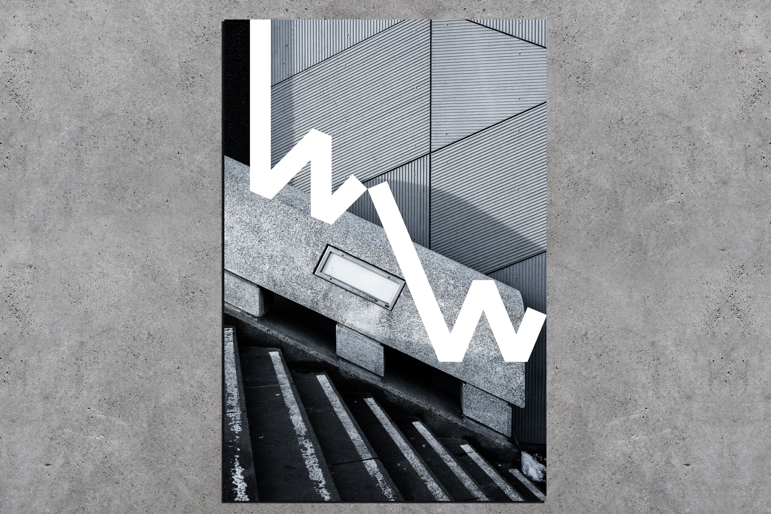
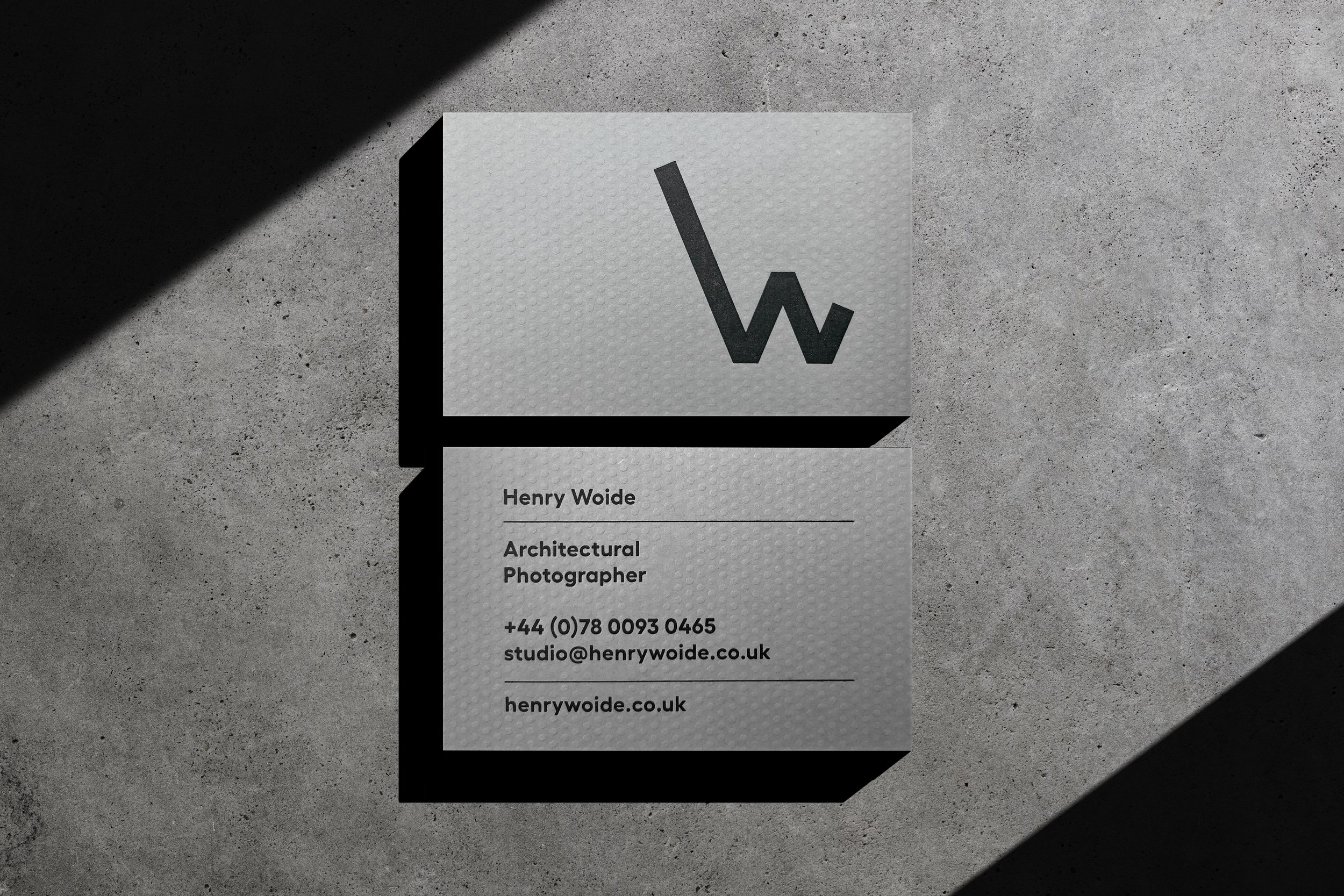
The idea here is that the logo shape can be interpreted both as a lowercase h and uppercase W.
Henry and I both have a passion for brutalist architecture so we decided to use a premium paper stock which was especially embossed to emulated concrete slabs.