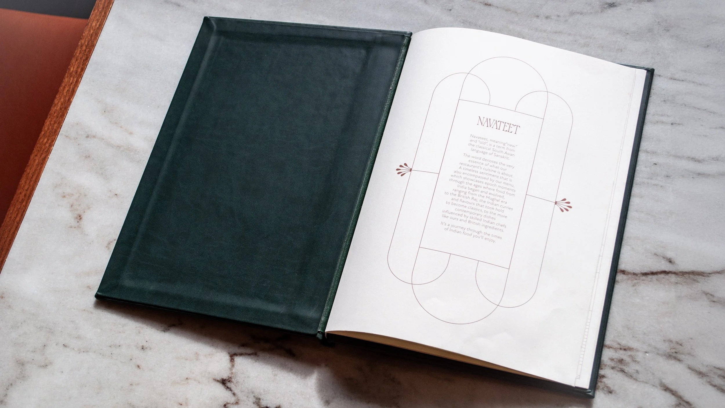
The name Navateet blends the Sanskrit and Hindi meanings of ‘new’ and ‘from the past,’ capturing the fusion of heritage and modernity themes at the heart of the restaurant’s Indian cuisine.
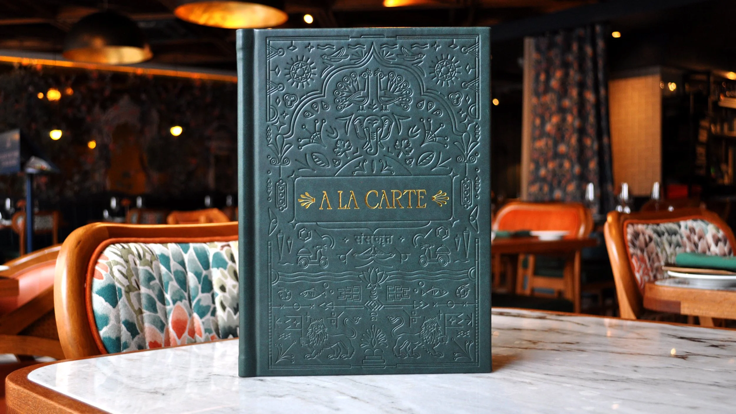
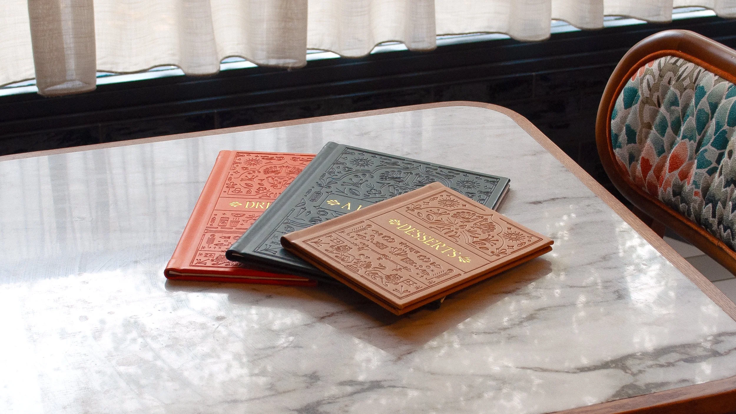
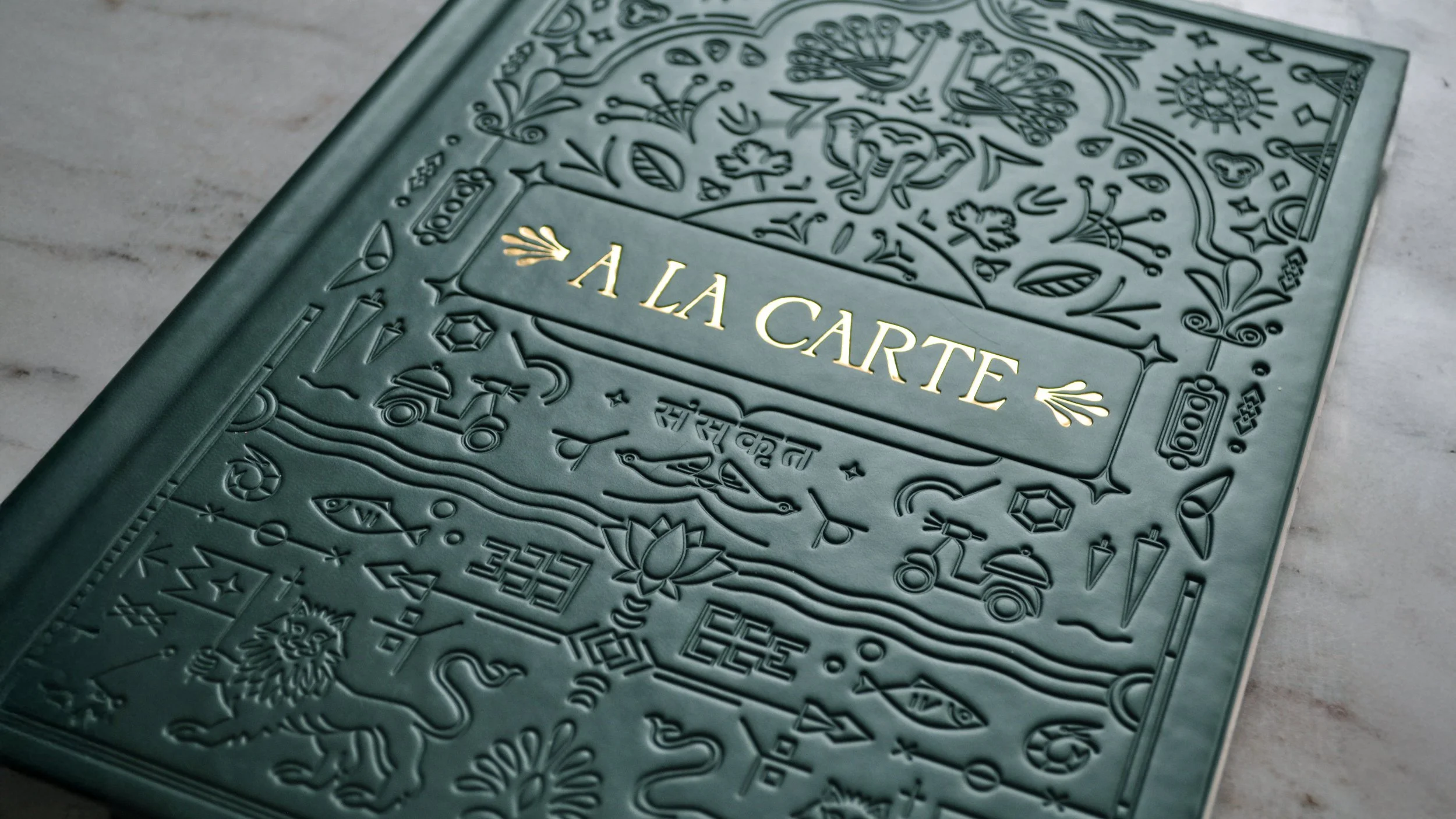
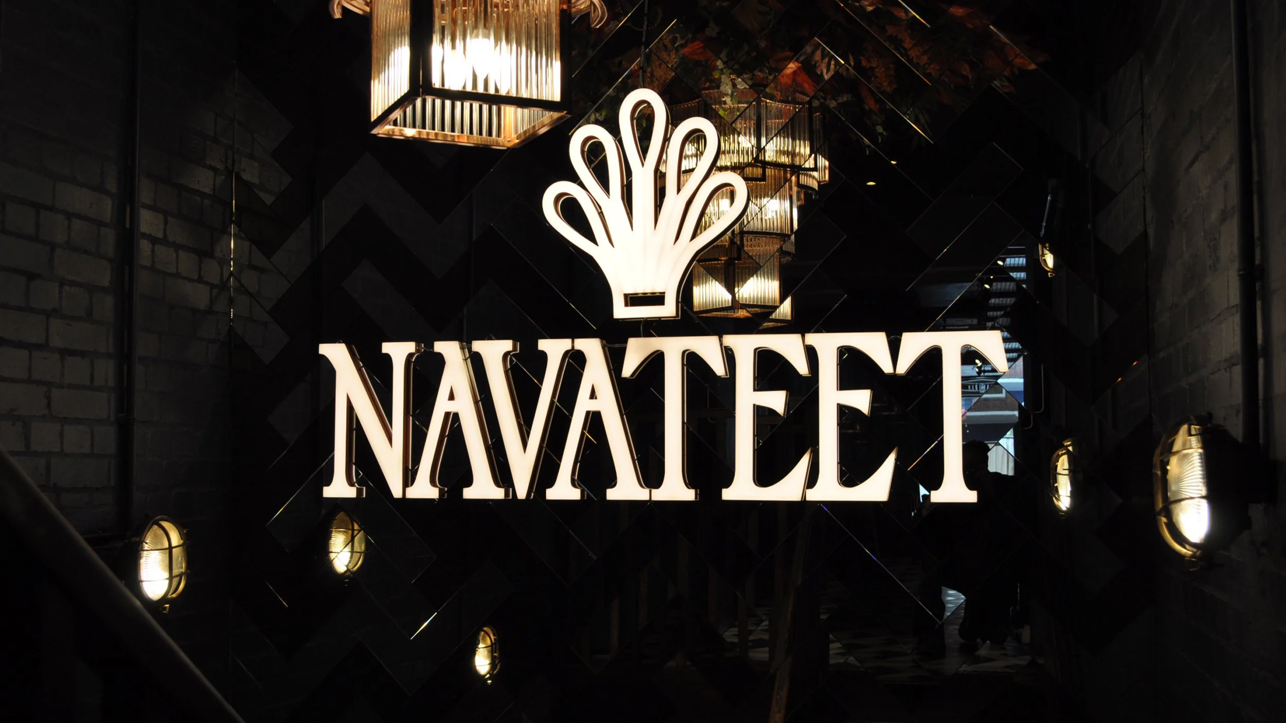
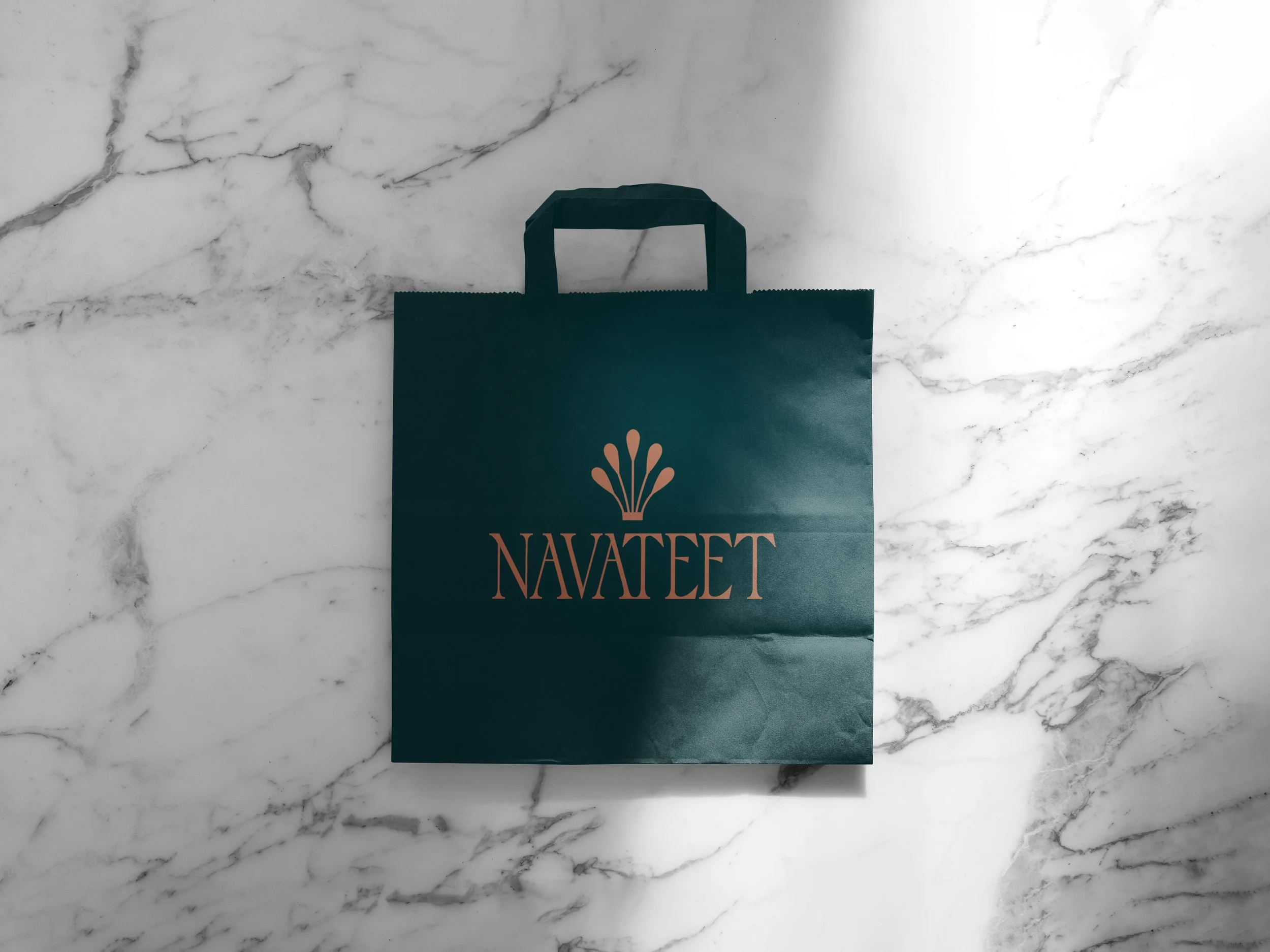
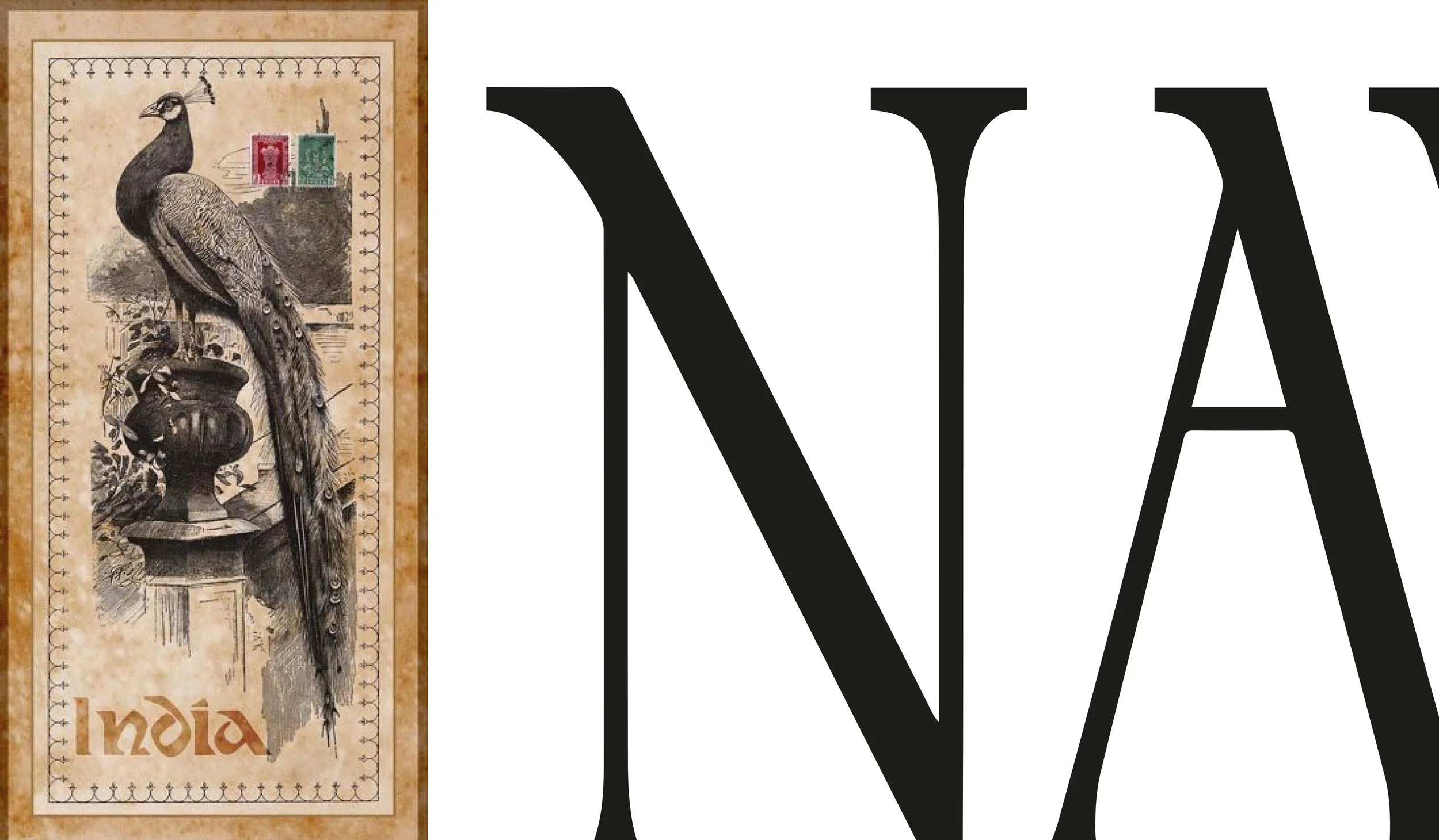
Using the head ‘crown’ of the peacock instead of the obvious open feathers I created the brand icon. The selection of typeface ‘Palace’ for the core brand typography reflects the beak shape of the bird.
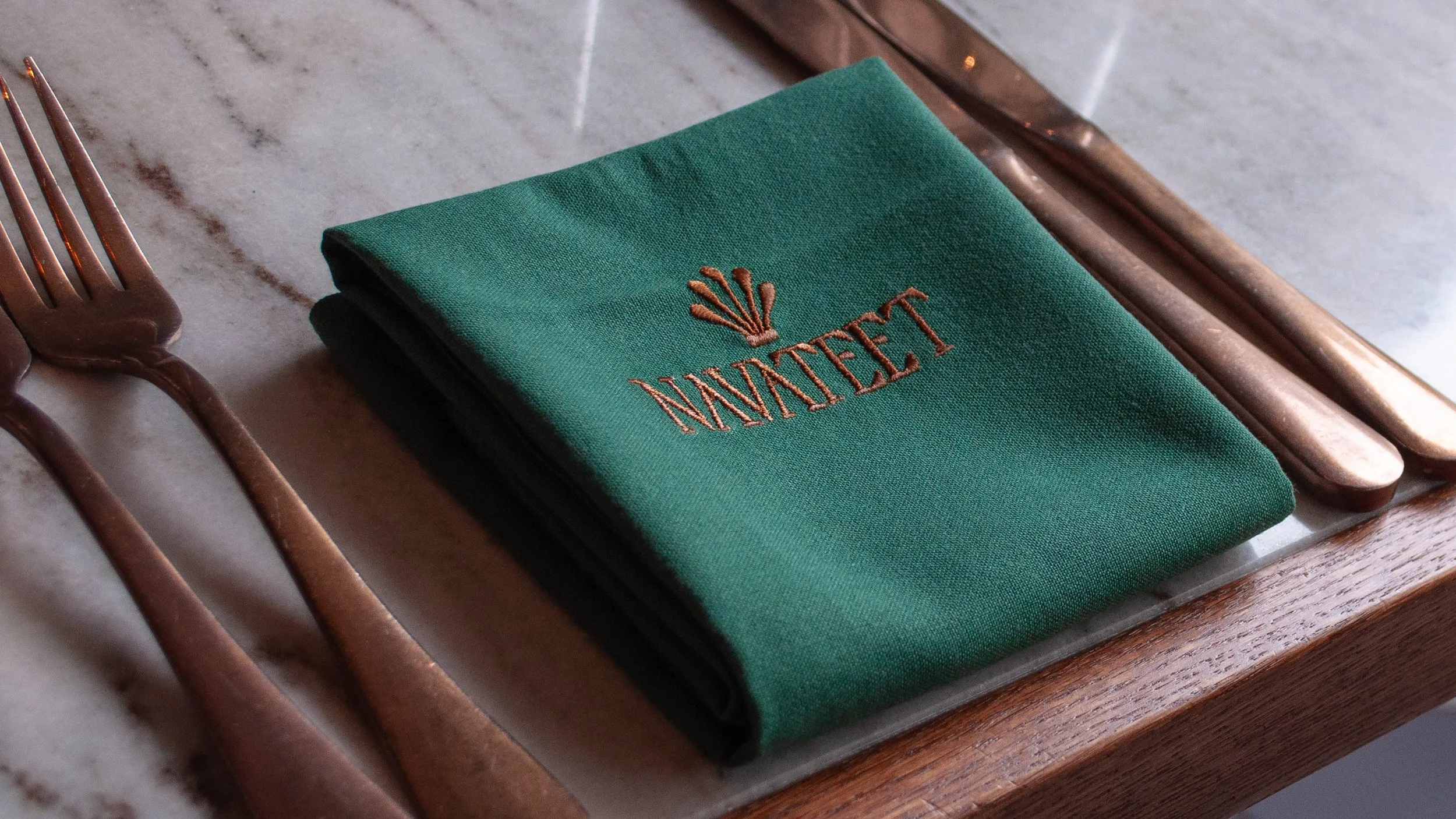
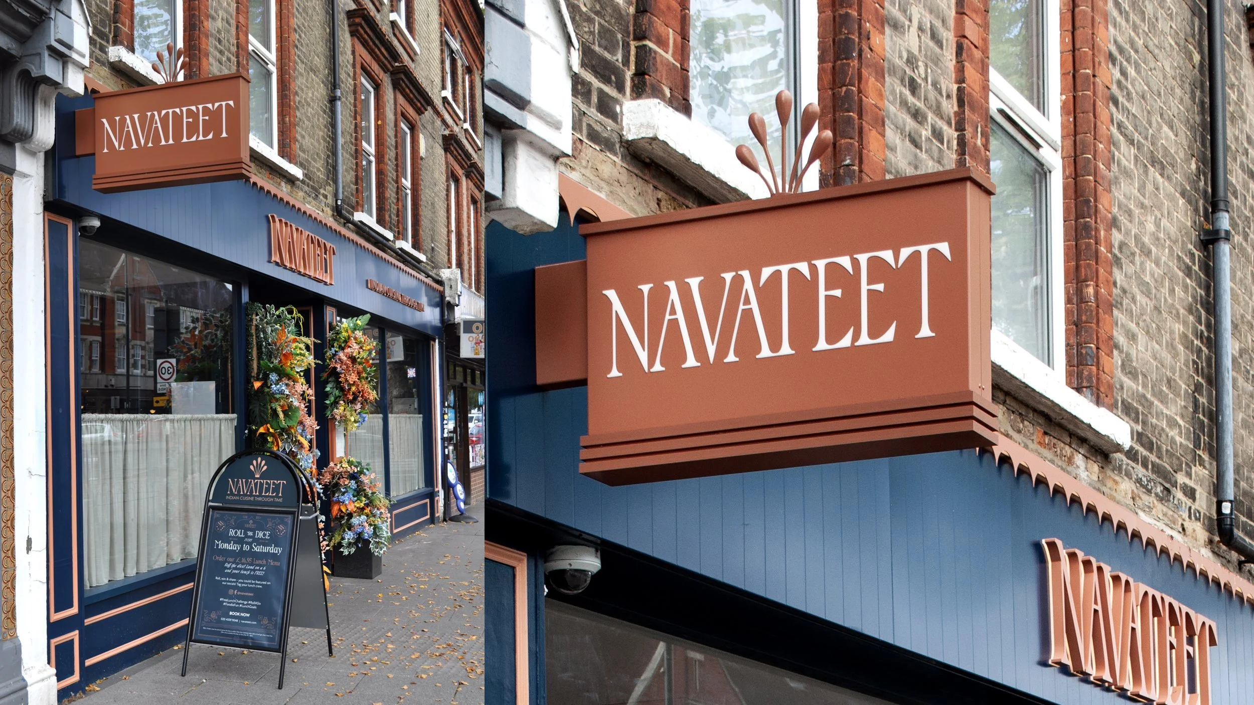
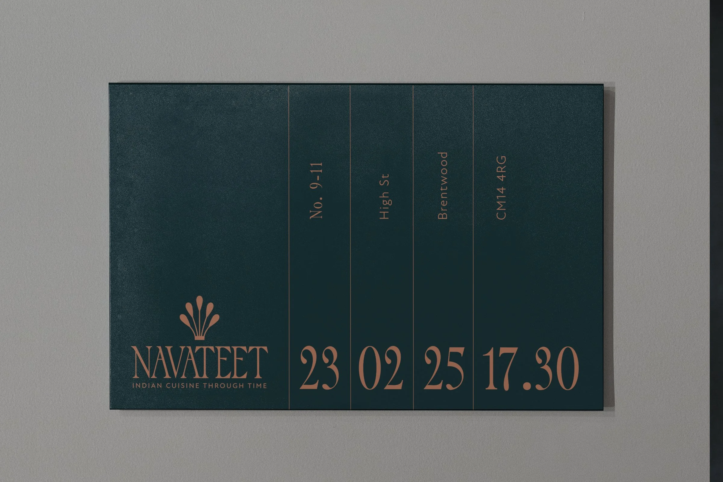
Brand graphics were designed for showpiece menus, striking mirrors and elegant signage. A tailored set of art deco inspired illustrations were also created to use in brand communications.